Colour blindness, also known as colour vision deficiency (CVD), is a visual impairment that affects how people accurately perceive certain colours. It also covers a wide range of diverse visual abilities. For example, people with CVD might grapple with other vision challenges, like near-sightedness, farsightedness, or light sensitivity. Therefore, it’s important to recognise this diversity because what works for one visually impaired person on your website may not work for another.
According to Colour Blind Awareness, approximately 300 million people worldwide experience some form of CVD. It's not exactly a rare condition but rather a prevalent one affecting a large portion of the population.
Types of colour vision deficiency
Most people with typical colour vision can distinguish between red, green and blue light. Colour vision deficiency (CVD) affects how some people perceive these colours.
The most common types of CVD are outlined below.
Protanopia: red blindness
People with protanopia have reduced or no sensitivity to red light.
They may confuse red with black, dark brown or dark green.
Deuteranopia: green blindness
People with deuteranopia have reduced or no sensitivity to green light.
They may find it difficult to distinguish between red, green and brown tones.
Tritanopia: blue blindness
People with tritanopia have reduced or no sensitivity to blue light.
They may confuse blue with green, and yellow with light grey or violet.
Monochromacy: limited colour vision
People with cone monochromacy have only one functioning cone type.
This results in very limited colour discrimination. Interfaces that rely only on colour differences can be difficult to interpret.
Achromatopsia: total colour blindness
People with achromatopsia do not perceive colour and see only shades of grey.
Any meaning conveyed through colour alone may be lost. Strong contrast, labels, patterns and clear structure are essential for accessibility.
The image below shows how protanopia, deuteranopia, tritanopia, and monochromacy differ from normal vision.

Designing for colour accessibility
To create products that are accessible to colour blind users, here are some important considerations to keep in mind:
1. Colour contrast
Contrast is important for ensuring readability and usability for all users. It is graded as 'A,' 'AA,' and 'AAA,' with 'AAA' being the gold standard for accessibility. Meeting at least the 'AA' level of contrast is essential to comply with W3C's standards. This includes considering regular type sizes and larger fonts for body text.
There are many online tools and plugins available for assessing the accessibility of your colour choices. To learn more about colour contrast, you can visit the Accessibility and Inclusivity Toolkit. Also check out our latest blog post on colour contrast.
2. Using patterns and shapes for inclusive design
Patterns and shapes play a pivotal role in making designs more accessible. Consider how patterns can replace colour differentiations, especially in elements like graphs. Trello's "colour-blind friendly mode" for labels serves as a great example of inclusive design through pattern usage.
3. Avoid colour alone for meaning
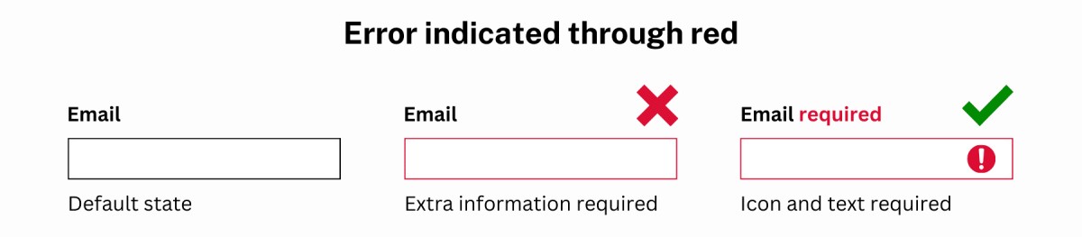
For example, buttons and forms should not solely depend on colour to be noticeable to users with low vision or colour blindness. It should also have enough contrast with the colours around it so that it stands out clearly. Designers can employ various design elements, such as borders, type weight, type sizing, opacity, placement, and icons, to convey information without relying solely on colour. This is important for making buttons and forms accessible to all users.
The image below displays examples of both incorrect and correct uses of an email validation error message.
Check out the NSW Design System and the NSW Government Branding Guidelines for more information on icons, colours, and graphic elements.
4. Colour descriptions
Colour descriptions are explanations or textual cues that accompany visual elements, such as graphs, charts, or images, to convey information typically represented by colour.
Examples of colour descriptions:
- Pie Chart: Instead of relying solely on colour to distinguish sections of a pie chart, use labels like "Blue: 30%" or "Green: 20%" to describe each segment's colour and percentage.
- Map: When colour-coding regions on a map (e.g., for a heat map), provide a legend or key that explains what each colour represents. For instance, "Dark Red: High Temperature" and "Light Blue: Low Temperature."
5. Usability testing
After ensuring colour accessibility in your products, usability testing becomes essential. Feedback from users can help refine your products and ensure their true accessibility. Your products should be data-informed, and user feedback should guide the search for the right balance.
For more information on creating content that everyone can use, check out the Accessibility and Inclusivity Toolkit. Within it, you can find the resources, tools, and training needed to help you meet accessibility guidelines and ensure that your products and services are accessible to everyone, regardless of abilities.